
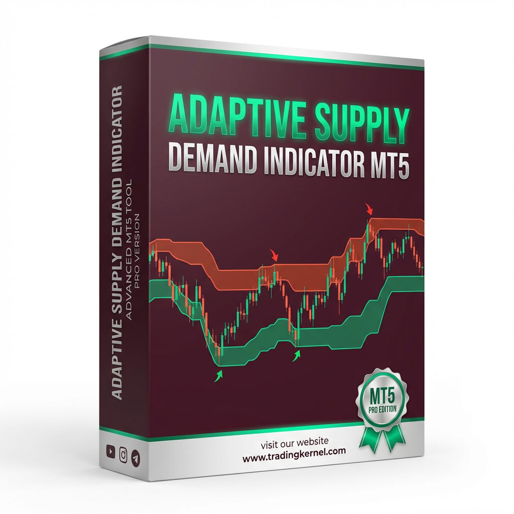

Adaptive Supply Demand
Supply and demand zones that grade themselves. Every zone is scored, marked fresh or tested, and checked against higher timeframes, with a live panel, a 15-symbol scanner and built-in statistics that show how zones have actually behaved on the chart in front of you.

Not every zone deserves the same attention
Most supply and demand tools draw every zone the same. This one tells you which ones are strong, which have already been tested, and what it has actually measured about them.
Score, not just a box
Each zone carries a letter grade and a 0–100 score, plus whether it is fresh or has been tested, so you can rank them at a glance.
Higher timeframes in view
Higher-timeframe zones sit behind your chart, and zones nested inside them are flagged, with old and still-forming zones shown on request.
A plan on the chart
Reversal-candle, fake-breakout and nested-zone markers come with entry, stop, two targets and a risk-based position size.
Statistics on your chart
The indicator measures how zones reacted and how often its markers reached target, and greys out samples that are too small to trust.
Three tabs, one live dashboard
Everything sits in a collapsible panel on the chart. Press H to hide or show it.
The whole picture in one glance
- Market bias with a count of how many opposing zones price has broken, and the strength settings in use.
- Higher timeframes being read, and the time until the next news event.
- Nearest supply and nearest demand: price range, distance in ATR, grade and score, fresh or tested, and the pattern that formed it.
- Last signal: direction, trigger, time, entry, stop loss with its risk, TP1 and TP2 as R multiples, position size at your risk %, and the quality of the zone behind it.
- Eight one-tap toggles: Zones, HTF, Old, Forming, Signals, Labels, Prices, Levels.
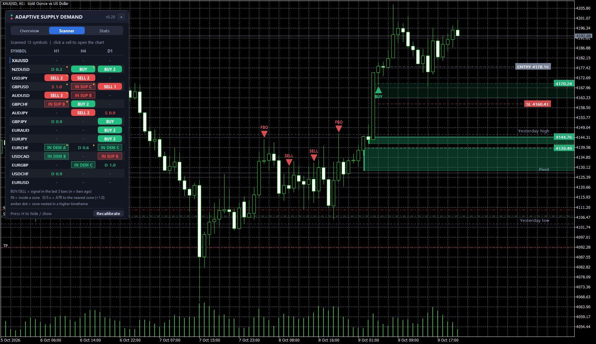
15 symbols, three timeframes, one table
- Scans 15 symbols across H1, H4 and D1 from a single chart. Click any cell to open that chart.
- A marker in the last 3 bars shows as a coloured cell, with the number of bars ago.
- Price inside a zone shows the zone and its grade; price within one ATR of a zone shows the distance.
- An amber dot means the zone is nested in a higher-timeframe zone.

It reports on itself, including the awkward numbers
- Zone reaction on first touch: how often price moved a full ATR away before breaking, split by demand and supply, nested or not, grade, and flip zones.
- Marker results: how often each trigger type reached TP1 before the stop, the average result in R, and how often TP2 was reached.
- The sample window is always shown, and any figure built on fewer than 20 cases is greyed out as too few to trust.
- No cherry-picking: whatever your chart's history says is what you see, so you can judge for yourself which zones to trust.
The screenshot is one reading on one chart. Results differ by symbol, timeframe and period, and past reactions do not guarantee future ones.
Every zone explains itself
Each zone carries a short label. Here is how to read one.
| Part | What it tells you |
|---|---|
| DEMAND / SUPPLY | Which side the zone sits on: green for demand, red for supply. |
| RBR, DBD… | The price pattern that formed the zone, such as rally-base-rally or drop-base-drop. |
| FLIP | A zone that was broken and now acts from the other side. |
| A 81, B 63, C 41 | Letter grade and 0–100 score. Higher means a stronger zone by the indicator's own measure. |
| fresh / tested x2 | How many times price has come back to the zone since it formed. |
| size 3.16 | The height of the zone in price. |
Also on the chart: yesterday's high and low, the pivot, and shaded higher-timeframe zones (such as H4 demand), each with its own toggle.

The plan is drawn before you decide
When a marker appears, the chart shows where the idea is wrong (the stop) and where the next zones are (the targets), with each distance expressed as a multiple of the risk. Here is the example from the screenshot.
Example from the XAUUSD H1 screenshot (BUY, reversal candle). Illustration of how levels are displayed, not a forecast or a result.
- Entry and stop are drawn on the chart, with the risk in price shown beside the stop.
- TP1 and TP2 sit at zone edges and show their R multiple.
- Position size is worked out from your risk percentage and capped at the broker's maximum lot.
- Zone quality (grade, score and fresh or retest) is shown with every marker so you can judge it, not just follow it.
- Marks that are still open are flagged LIVE.
Markers are chart annotations for your own analysis, not instructions to trade.
Reversal candle
Marked when a reversal candle forms at a graded zone.
Fake breakout (FBO)
Marked when price pushes through a zone and fails to hold beyond it.
Nested zones
Marked when a zone sits inside a higher-timeframe zone, so the two line up.
What this tool is, and is not
- A grade is a measurement of how a zone has looked and behaved in the past. A high grade does not mean a zone will hold. Zones fail often, and the Stats tab exists so you can see how often on your own chart.
- The statistics are calculated from a limited number of bars. Small samples are greyed out, and even large ones describe the past only.
- Markers, entries, stops and targets are drawn for analysis. They are not recommendations, and you are responsible for every trade you take and the risk you accept.
- It is a chart indicator. It does not open, manage or close trades, and it never holds or moves your funds.
- Trading leveraged products such as gold and forex carries a high risk of loss. Use it alongside your own strategy and risk management, never on its own.
At a glance
| Platform | MetaTrader 4 and MetaTrader 5 |
| Type | Chart indicator |
| Version | 5.20 |
| Zones | Supply and demand, graded A+ to C with a 0–100 score, fresh or tested, flip zones, old and forming zones |
| Higher timeframes | Overlaid and flagged when a zone is nested (H4 and D1 in the screenshots) |
| Entry markers | Reversal candle, fake breakout, nested zones, with entry, stop, TP1, TP2 and position size |
| Scanner | 15 symbols across H1, H4 and D1, click to open a chart |
| Statistics | Zone reaction and marker results measured on the chart's own history; samples under 20 greyed |
| On-chart levels | Yesterday's high and low, pivot |
| Controls | Eight toggles, collapsible panel, Recalibrate button, H to hide or show |
Before you buy
Does it place trades for me?
What is the difference between a zone and a marker?
Does an A grade mean the zone will work?
Why are some statistics greyed out?
What does Recalibrate do?
Which instruments and timeframes does it suit?
Can I turn parts of it off?
Know which zones deserve your attention.
Graded zones, higher-timeframe context, a 15-symbol scanner and statistics that measure themselves, on one chart.
Trading foreign exchange, CFDs and other leveraged products carries a high level of risk and may not be suitable for all investors. Past performance is not indicative of future results. Statistics shown in screenshots are the indicator's historical readings on a limited sample and are not a forecast. This indicator is a charting tool and does not provide investment advice.
No comments yet — be the first to share your experience.
You must be logged in to post a review.

Reviews
Clear filtersThere are no reviews yet.